Jess and Lonn… what can I say? Beautiful people, beautiful hearts, beautiful wedding. I was thrilled to be a part of it. It’s still one of my favorites, so I thought I’d share with you. Here’s some shots of the stationary I created just for them…
  The pearl details went with the girl’s jewelry, and the fun yet elegant envelopes were from Envelopements. The photos used in the stationary are by Dustin Waller Photography. The pearl details went with the girl’s jewelry, and the fun yet elegant envelopes were from Envelopements. The photos used in the stationary are by Dustin Waller Photography.
  {the details: The gorgeous photographs from the wedding are from Lark Photography, and the cute pear idea is from Martha Stewart Weddings. The wedding and reception were both at Briggs Mansion}. {the details: The gorgeous photographs from the wedding are from Lark Photography, and the cute pear idea is from Martha Stewart Weddings. The wedding and reception were both at Briggs Mansion}.
Jess and Lonn–it was my pleasure to be a part of your special day! Happy anniversary week!! xo, linds
Hi there! I started my evening productivity late last night with a long overdue trip to the grocery store. My list ranged from the mundane {cereal, bananas} to the fun {items to make bacon wrapped dates for Christmas Eve!} When I got home, I was “starving,” so I decided to make myself a snack while I worked on finishing up some free-form calligraphy for a project. As I sipped and snacked, I sensed a theme in my evening… a cranberry lime theme, if you will. The envelopes I was using are the 4 Bar chartreuse from Paper Source, and the India Ink is actually fuchsia. However, semantics aside, cranberry and lime was the tone for this particular setting. Here’s some visual evidence…
 
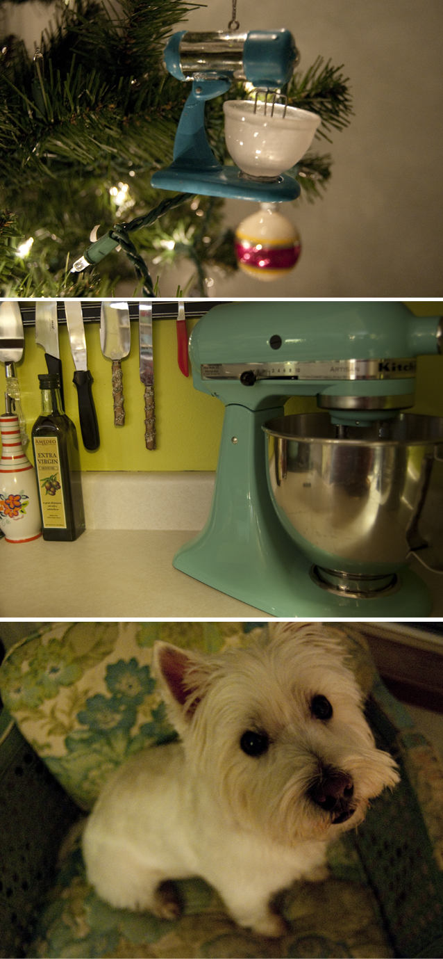
That juice is tart but yummy! The sweet little green deer {that freaks Dugan out} was a prop Sarah and I scouted while shopping for a shoot at the Antique Mall. In the background of that picture you can see a waiting to be opened birthday gift from dear Leah. She always wraps such pretty packages, I’m using it as decoration until the 24th. The tag reads “Merry Birthday!” Love it! Leah’s also responsible for giving me the awesome vintage pyrex that I used to mix my yummy snack in. For my snack, I took a que from Emily at Cupcakes and Cashmere. {If you have some free time today, you must stop by her blog. She’s a noted fashionista, but also has some really great tried and true recipes she shares. Food and fashion–perfect!} Anyway, she tweeted once about a similar mix she made, and I’ve been craving it ever since. I just mixed 1 packaged Godiva dark chocolate chips, 1 package of crazins, and one package raw almonds. Yum! Now I have an antioxidant rich snack to last us all week long. {Those place mats are from Target}. Also from Target {but has nothing to do with cranberry and lime} is this super fun ornament I found. D has a strict “no ornaments that don’t mean anything” policy, but I figured that since I have a special place in my heart {and our home} for blue mixers, this ornament fit the bill.
  I had to include Riley because he looked at me so curiously when I was photographing the ornament. :o) Okay, I’m off to make some homemade chicken noodle soup for my hubby when he gets home, and to create some more lovely letters while it’s simmering. Happy night off to me! xo, linds I had to include Riley because he looked at me so curiously when I was photographing the ornament. :o) Okay, I’m off to make some homemade chicken noodle soup for my hubby when he gets home, and to create some more lovely letters while it’s simmering. Happy night off to me! xo, linds
This season has been crazy, but this morning I woke up thinking that I’m not ready for it to be over. Actually, I think the space between Thanksgiving and Christmas should be longer, and the space between New Year’s and the time it will be comfortable to run outside should be shorter. So anyway, I woke up this morning grateful for this season, for why we celebrate, and the people I have in my life to celebrate with. Do you need a little pick me up this afternoon? Sweet clothes, sweet vocals, and a sweet message {what else would you expect?} from the Girls with Glasses in the video below.
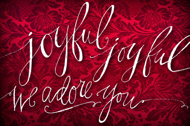
Live in the Rockford area? Come to A Heartland Christmas. It will be a feast for your ears, eyes, and soul. {I promise}. I’ve been hard at work this month and really can’t share much of it, but below is a calligraphy piece that I worked on yesterday. It’s being animated right now by my friend Dustin at 529motion. Can’t wait to see it come to life!
 
I just love designing wedding invitations. LOVE it. The weird part about designing wedding invitations, however, is that the finished product is not supposed to look like me. It’s supposed to look like the couple I’m designing for. This definitely makes it all the more challenging, but even more rewarding. I love learning about people, designing, and making people happy. On a good day {and most days are}, creating invitations involves all three.
Jon was in our wedding, and I was so honored to get to help with his. Leslie was so sweet, chill, and relaxed… the perfect December bride! And she was gorgeous, too. Her vision was black & ivory with bits of green, an homage to her kermit mums. The design is sweet and crisp–a kind of unexpected take on December. I have a lot of fun creating custom maps, and this graphicy little map was no exception. Here’s some photos of the invitation suite…
 
I took a que from my days in marketing and created a response card that perforates and then sends in as a postcard. This saves on waste, envelope cost, and postage. It also makes for a pretty neat package since you don’t open an envelope and have things fly and fall out at you. The invitation was mailed in a crystal clear envelope, so you could see the invite right through it! Here are some photos of the super fun wedding and more of the stationary I created for the event. {This wedding, by the way, treated us to some of the best wedding food I’ve ever had}. Thanks for the privilege of being part of your day, my friends, and happy anniversary month! xo, linds
  *photo credit to come!! *photo credit to come!!
Hi there! I literally fell asleep ON my computer last night. How are you?
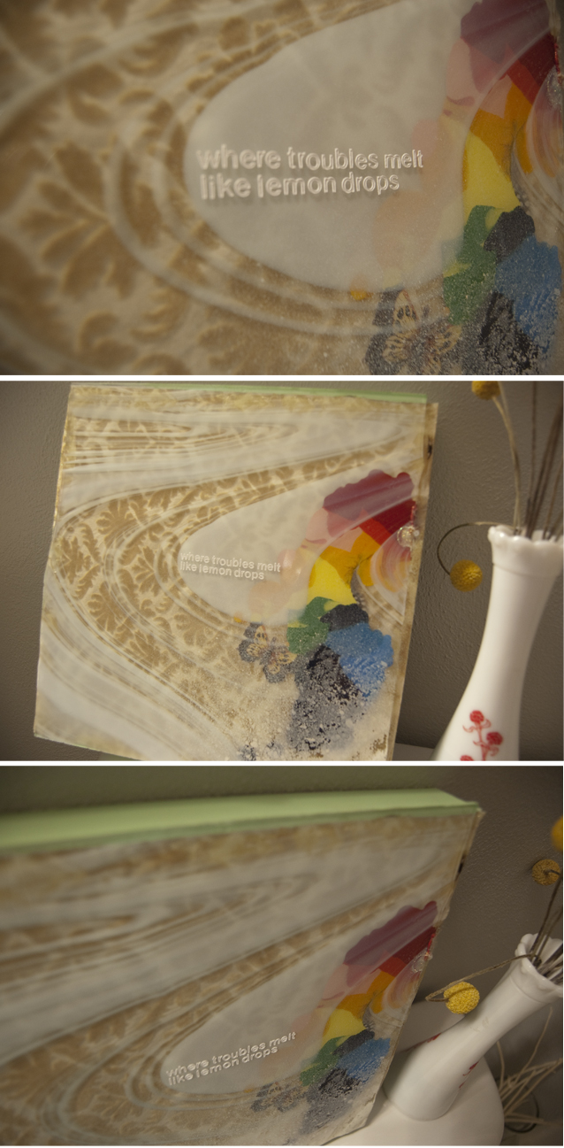
Have you ever read the book If You Give a Mouse a Cookie? I think about this book probably once a week. That, in a nutshell, describes my life. Not always in the “I want” way, but in a bunny-trail kind of way. So. I went upstairs yesterday to grab my camera to photograph an invitation for today’s post. When I got up there, I realized I have a painting in my house that would have gone perfectly with yesterday’s post! One of my favorite things to do when I have some creative down time {once every 2ish years} is to make paintings. I call it make paintings instead of paint paintings, because they’re really more like assemblages than a painting. Pretty much like graphic design but using a different medium. I used to make big paintings, but now I really don’t feel like putting the time into them. So, now I really enjoy making what I refer to as tiles. It’s not actually a tile… just a smaller, 14″ x 14″ square. So, here’s a look at one of my not really a painting paintings, in the form of a not really a tile, tile. It’s called Somewhere Over the Rainbow.
  The tile is actually hanging outside of my upstairs bathroom, but my house is so bright with all the bright/light colors inside, all the windows, and all the snow, I’m having a really hard time taking pictures lately. So, I moved her into my bathroom. And while I was in my bathroom, I thought, “I love this bathroom.” And so I thought you might, too. This bathroom used to be really unfortunate color {my own fault}, but I asked Chrissy to fix it, and she picked Light French Grey {our new favorite color ever} and it went perfectly with all the yellows, whites, and ivories already in there. And now, I love it. I want to paint my life Light French Grey… The tile is actually hanging outside of my upstairs bathroom, but my house is so bright with all the bright/light colors inside, all the windows, and all the snow, I’m having a really hard time taking pictures lately. So, I moved her into my bathroom. And while I was in my bathroom, I thought, “I love this bathroom.” And so I thought you might, too. This bathroom used to be really unfortunate color {my own fault}, but I asked Chrissy to fix it, and she picked Light French Grey {our new favorite color ever} and it went perfectly with all the yellows, whites, and ivories already in there. And now, I love it. I want to paint my life Light French Grey…
 
the details: the blue mason jar is leftover from our wedding. It was so hard to find so many mason jars, I just had to keep a couple around! The lemon candle I stole{ish} from Sarah when she broke my heart and moved to Australia for a YEAR. It was the least she could do for me. The green votive was at Poska {only $1!} The dinosaur… yea… D loves dinosaurs, and I try to incorporate little bit of things he likes around our house so people can tell he lives here. He actually chipped those little bones out of clay and had to put it together, which I think is pretty rad. The old book is from a few boxes of old books I rescued from the curb at my grandma’s. We have books everywhere at our house. D likes to read, and I like to look at them. The bird frames & prints are from Marshall’s, and there’s another one of my tiles on the wall, Psalm 62. Also on that wall is a Raindrop–a special gift for me made by and from Roland Poska. {I try to have as much original art in our home as possible}. The vase is antique milk glass, and the shower curtain is from Anthropologie {as are the yellow bath towels}. My newest piece of art is that sketchy piece you see. It didn’t photograph very well, but I love it. The extremely talented Alissa Eiesland created it, and it’s one of my favorite pieces in my collection.
p.s. Need a custom painting-ish tile-ish square of love in your life? Email me at lindsayletters@gmail.com and we’ll work something out!
« OLDER
NEWER »
|
 The pearl details went with the girl’s jewelry, and the fun yet elegant envelopes were from Envelopements. The photos used in the stationary are by Dustin Waller Photography.
 {the details: The gorgeous photographs from the wedding are from Lark Photography, and the cute pear idea is from Martha Stewart Weddings. The wedding and reception were both at Briggs Mansion}.
.jpg)
.jpg)
.png)


.png)
.jpg)
.jpg)


