I got fun mail! Not just any mail, but mail from a n o t h e r c o n t i n e n t! I saw this wall planner from Present&Correct, and I knew it would be the perfect thing for my office to keep all my client’s important dates all in one visual space. The calendar is everything I’d hoped it would be! Someday I’ll post photos off my studioffice, but until then hop on over to their site and take a look. {Thanks to Charlotte at Lottie Loves for the idea!} xo, linds
 
p.s. if you’re still in the market for a new calendar, all the ones at Paper Source are 50% off. Click here.
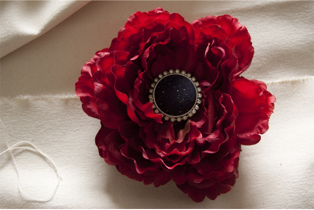
p.p.s. Since I’m show-in-telling, check out my new HeirBloom that Ahndea made just for me! Can’t wait to wear it with my navy & white stripey T! I just photographed her new spring line. Head over to her etsy shop and take a look!
 
So… I’m almost a little embarrassed to post this. But, well, this is a visual blog and this is certainly something to look at…
  Um, so that’s me. And that’s my hair. Not my hair over the course of a couple years… not over one year… not even over the course of a month. That’s me, and my hair, and what I did to it over the course of 2 weeks. Yep, that’s right. I’m not going to lie… I do this every winter to some extent. I wake up, look outside, look in the mirror, and decide that it’s time for a change. I started with semi-permanent “light auburn,” and I really did love it {#2}. But it washed out in 2 days. So then I thought I might as well commit, and colored my hair permanent “light auburn,” which actually equated to “bright orange.” Truth be told, the hair color wasn’t what bothered me. I actually kind of liked it–but I tend to wear lots of bold statement type things, and I’m just not sure Rockford was ready for orange hair + fuchsia lipstick + kelly green coat. Anyway, as the week progressed it turned from orange to the color of a safety vest. And the blonde was starting to show through in chunks. Awesome. Then I just thought what the heck, I’ll just become a brunette and start over. {I started sun-in-ing my hair when I was 12 and I’ve never looked back. I’m not even sure what color it’s supposed to be}. The brunette look was… nice. All it took was one date to realize that was not the look for me. I was so excited to wear my new yellow dress with red lipstick, and I got dressed and felt like I looked like I was trying to look {unsuccessfully} like a pin up girl. Don’t get me wrong, I love pin up girls. But I’m kind of a mess… it would be a loose relation at best. Annnnyway, I was working on designing some business cards for a local salon where my sister-in-law Breeze works. I love that salon. Great people, and it’s beautiful. And, thankfully, Paula rescued me. So, there you have it. 4 different shades, 3 boxes of color, 2 weeks, hours at a salon, and a partridge in a pear tree. {And, I’m pretty much right where I started. Sans-roots, I guess. And Paula gave me a pitty trim. ;o) }. The moral of the story is next year, when I decide to do this again, tell me to just go buy a new headband and get over it. xo, linds Um, so that’s me. And that’s my hair. Not my hair over the course of a couple years… not over one year… not even over the course of a month. That’s me, and my hair, and what I did to it over the course of 2 weeks. Yep, that’s right. I’m not going to lie… I do this every winter to some extent. I wake up, look outside, look in the mirror, and decide that it’s time for a change. I started with semi-permanent “light auburn,” and I really did love it {#2}. But it washed out in 2 days. So then I thought I might as well commit, and colored my hair permanent “light auburn,” which actually equated to “bright orange.” Truth be told, the hair color wasn’t what bothered me. I actually kind of liked it–but I tend to wear lots of bold statement type things, and I’m just not sure Rockford was ready for orange hair + fuchsia lipstick + kelly green coat. Anyway, as the week progressed it turned from orange to the color of a safety vest. And the blonde was starting to show through in chunks. Awesome. Then I just thought what the heck, I’ll just become a brunette and start over. {I started sun-in-ing my hair when I was 12 and I’ve never looked back. I’m not even sure what color it’s supposed to be}. The brunette look was… nice. All it took was one date to realize that was not the look for me. I was so excited to wear my new yellow dress with red lipstick, and I got dressed and felt like I looked like I was trying to look {unsuccessfully} like a pin up girl. Don’t get me wrong, I love pin up girls. But I’m kind of a mess… it would be a loose relation at best. Annnnyway, I was working on designing some business cards for a local salon where my sister-in-law Breeze works. I love that salon. Great people, and it’s beautiful. And, thankfully, Paula rescued me. So, there you have it. 4 different shades, 3 boxes of color, 2 weeks, hours at a salon, and a partridge in a pear tree. {And, I’m pretty much right where I started. Sans-roots, I guess. And Paula gave me a pitty trim. ;o) }. The moral of the story is next year, when I decide to do this again, tell me to just go buy a new headband and get over it. xo, linds
When sweet Tory asked me to letter her place cards for her beach wedding just before Christmas, I was happy to take a little mental break from the winter wonderland here to think about beautiful weddings in warmer places! Here are some shots I took of the place cards…
  Tory purchased the cute sand dollar place cards on Etsy. {I’ll update with the shop link as soon as I have it}. And, because everyone wants to see beautiful wedding photos, here’s some shots from the wedding {and the place cards in action}. You won’t look at the lettering the first time though, because you’ll be lost in Tory’s eyes. Then, by the time you get over that, you’ll be thinking about how you want to be at a party in Florida. SO, when you get to the bottom of the post, go ahead and scroll back through again… Tory purchased the cute sand dollar place cards on Etsy. {I’ll update with the shop link as soon as I have it}. And, because everyone wants to see beautiful wedding photos, here’s some shots from the wedding {and the place cards in action}. You won’t look at the lettering the first time though, because you’ll be lost in Tory’s eyes. Then, by the time you get over that, you’ll be thinking about how you want to be at a party in Florida. SO, when you get to the bottom of the post, go ahead and scroll back through again…
 
The wedding at reception were at the beautiful Seagate Beach Club. All the wedding photos {except for the last photo of the place cards} were taken by Jeff Kolodny. Tory, you’re a beautiful bride and a lovely person. It was a pleasure to get to be a part of your special day. xo, linds
When I say Andy Warhol, what do you think of? Marilyn? Campbell’s soup cans? Not me. One of the calligraphers and illustrators I am most inspired by is indeed Andy Warhol. He began is career in advertising, and his early work is absolutely amazing. So tactile, imperfect yet refined, playful no matter the client, and his use of color and negative space is completely intriguing. A few months ago my husband took me to the Andy Warhol Enterprises Exhibit at the Indianapolis Museum of Art and it blew my mind. Half of me wanted to stay forever, and the other half of me couldn’t get to my studio fast enough. I wish I could walk through the exhibit with all of you, but here is just a taste. Thanks, Mr. Warhol. I am so inspired by your work. xo, linds
 
One of the many, many things I love about what I do is getting to meet all kinds of people with all kinds of amazing stories. I’m so happy to have met Rebecca and I loved getting to design her little boy Jackson’s birthday party invite. I love getting to do girly things most days, but it’s fun to get to switch it up! I think the mini paper airplanes and the embroidery thread add a fun, tactile element–what kid doesn’t want to touch things?! Check out photos of the custom invitation I created for Jackson below. Let’s hear it for the boys! xo, linds
 
« OLDER
NEWER »
|
.jpg)
.jpg)
.png)


.png)
.jpg)
.jpg)


