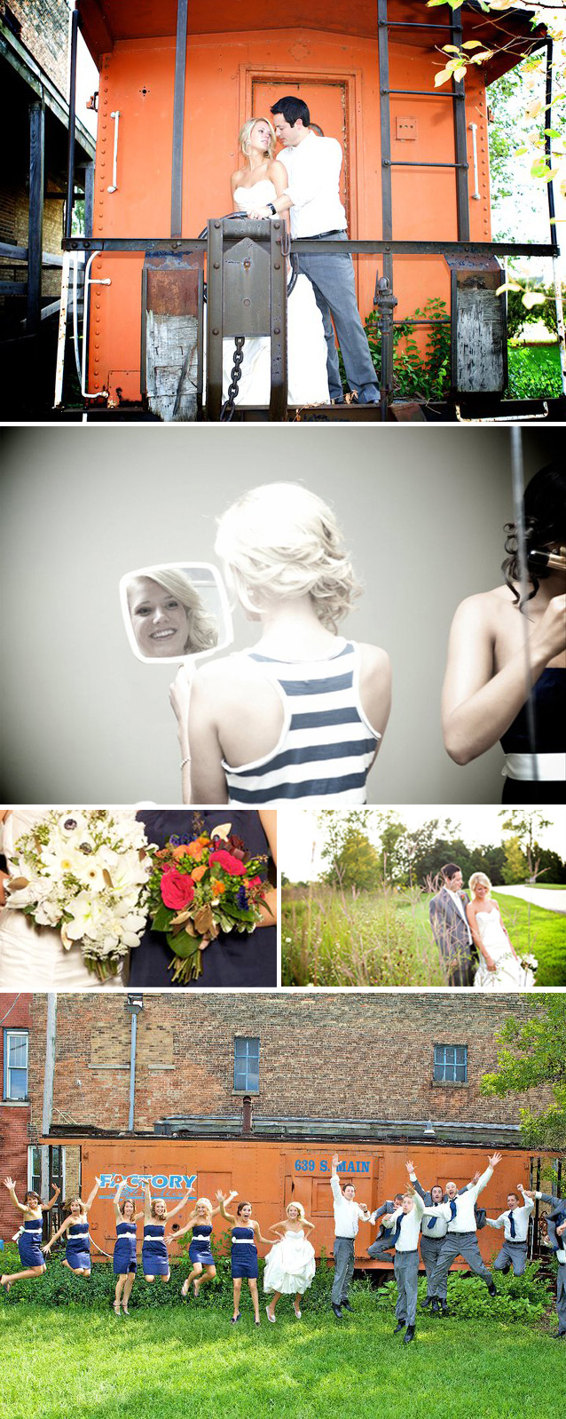
Haylee’s personality was beautifully represented in the palette she choose for her wedding… she is classic like a navy, but then bright and full of life like the pink and burnt orange accents. When she and her {awesome} mom Pam showed me the colors for the wedding, I was even more excited than I already was–what a fun combination! I always say, you’re only as good as your client… and let me tell you, I have been blessed with phenomenal clients! For her invites, I wanted to create something that was really clean and graphic, but also feminine at the same time. Letterpressed {at Flywheel Letterpress, also featured in this post} invitations slipped into a crisp navy envelope in night from Paper-Source {lined with a custom pretty paisley–Haylee’s favorite pattern}. The surprise of fuchsia return envelopes added a little punch to the entire suite. A fun directions card helped guests get from here to there.
Thanks so much for letting me part of your day, Haylee! You’re a beautiful person and you made a beautiful bride! xo, linds {wedding photography by humanitarian and life-capturer, dustin waller}
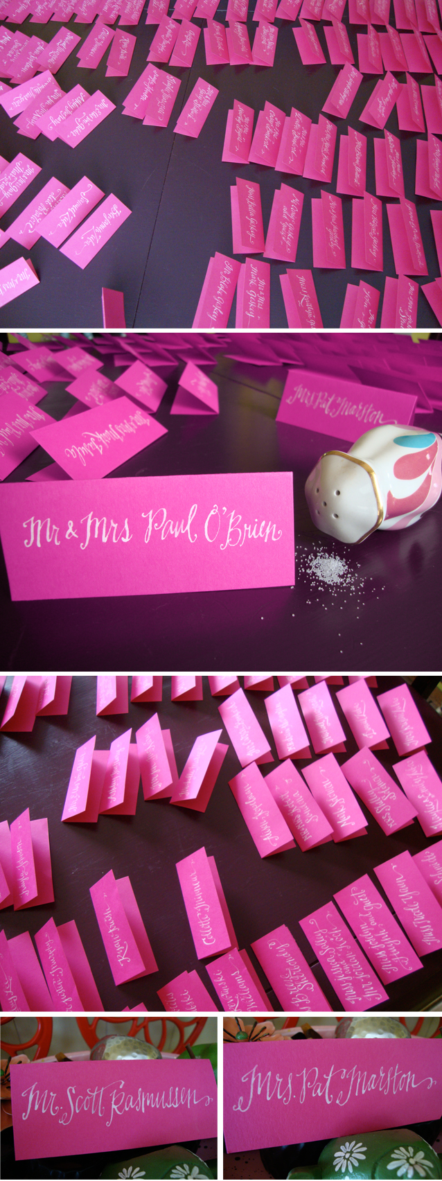
out takes: here are some shots of the escort card calligraphy production in my favorite spot to work: my kitchen. Interested in seeing more of the kitchen with the purple table? Click here :o).
.jpg)
.jpg)
.png)


.png)
.jpg)
.jpg)


